Color themes
Malcat comes with a bunch of color themes. You can switch your theme at runtime using the options dialog (cf. Changing options): . The dropdown list is populated with all .ini files located in <malcat install dir>/data/themes and in the User data directory: <malcat user dir>/themes.
While you won’t be able to customize 100% of Malcat’s user interface using themes (we are using some native widgets which can’t be themed), you will be able to change the colors of all Malcat’s views and most of its secondary controls.
You may have noticed that we are not experts in the subtle art of mixing colors. But good news, you can easily create your own theme. This chapter will guide you through the process.
Creating a theme: the workflow
The easiest way to get going is just to adapt a theme you like. I would say that the vs theme is a good starting point: copy <malcat install dir>/data/themes/vs.ini to either:
<malcat install dir>/data/themes/the_name_of_your_new_theme.ini<malcat user dir>/themes/the_name_of_your_new_theme.ini
When you are done, open the new theme file in your text editor of choice. In parallel, run Malcat and using the menu , select the_name_of_your_new_theme in the dropdown list. You now have switched to your new theme!
Now the editing can begin. Modify the .ini file in the text editor to your liking and save it. It is now time to test your new theme: Alt+Tab to the open Malcat window and either:
Hit Ctrl+Shift+R
Use the menu
Both of these actions will reload the theme ini file so that you can see your change in action. No restart needed! Now it’s just a matter of entering the right colors and reloading, until you are satisfied.
Colors description
A color theme is basically a list of named colors in the .ini format. In this chapter, we will go through most color meanings to make your life a bit easier.
Normal color
Under the [Normal] group you will find the default color, i.e. the color for normal text when no highlighting is specified at all. This is the most important color of the theme:
[Normal]
ForegroundColor=#000000
BackgroundColor=#fafafa
BackgroundAltColor=#e1f0e1
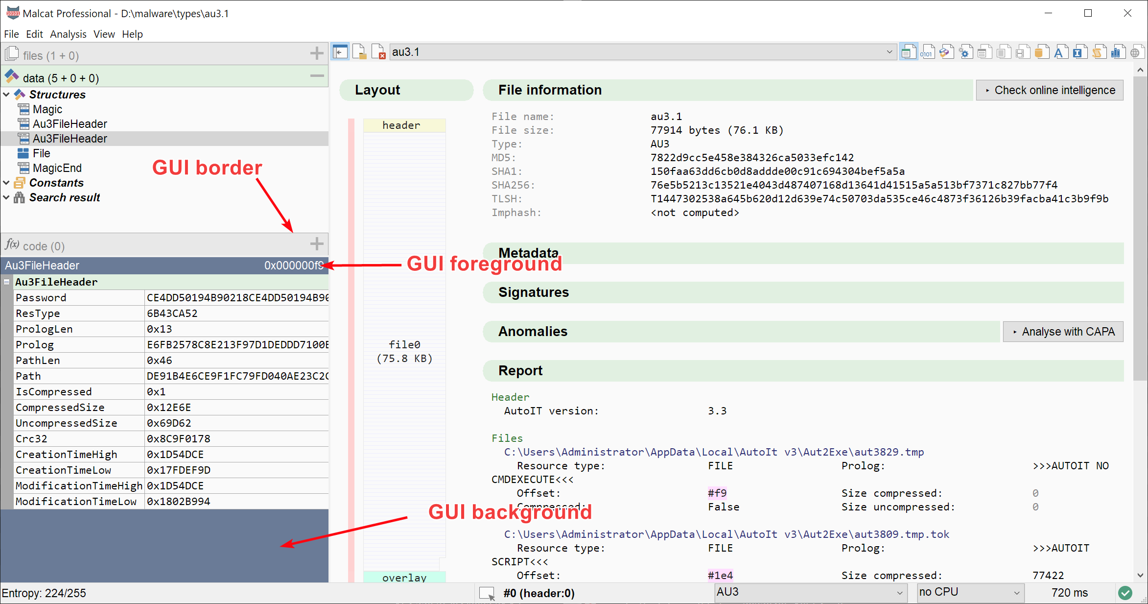
Note that this group specifies an alternate background color: BackgroundAltColor. This alternate background is used at many different places, like:
for title background in the Summary view
in every other 8-bytes column in the Hexadecimal view
for the category names in the Data preview, Symbols list, Threat intelligence report and Corpus search results
for the background color in the Proximity view and Function call graph
Make sure that the ForegroundColor contrasts well on top of both the BackgroundColor and the BackgroundAltColor.
GUI color
GUI colors are colors used in panels and tabs, when no control is displayed on screen. It is not used a lot in the user interface:
[GUI]
ForegroundColor=#ffffff
BackgroundColor=#6a7b97
BorderColor=#aaaaaa
GUI colors in use
Selection colors
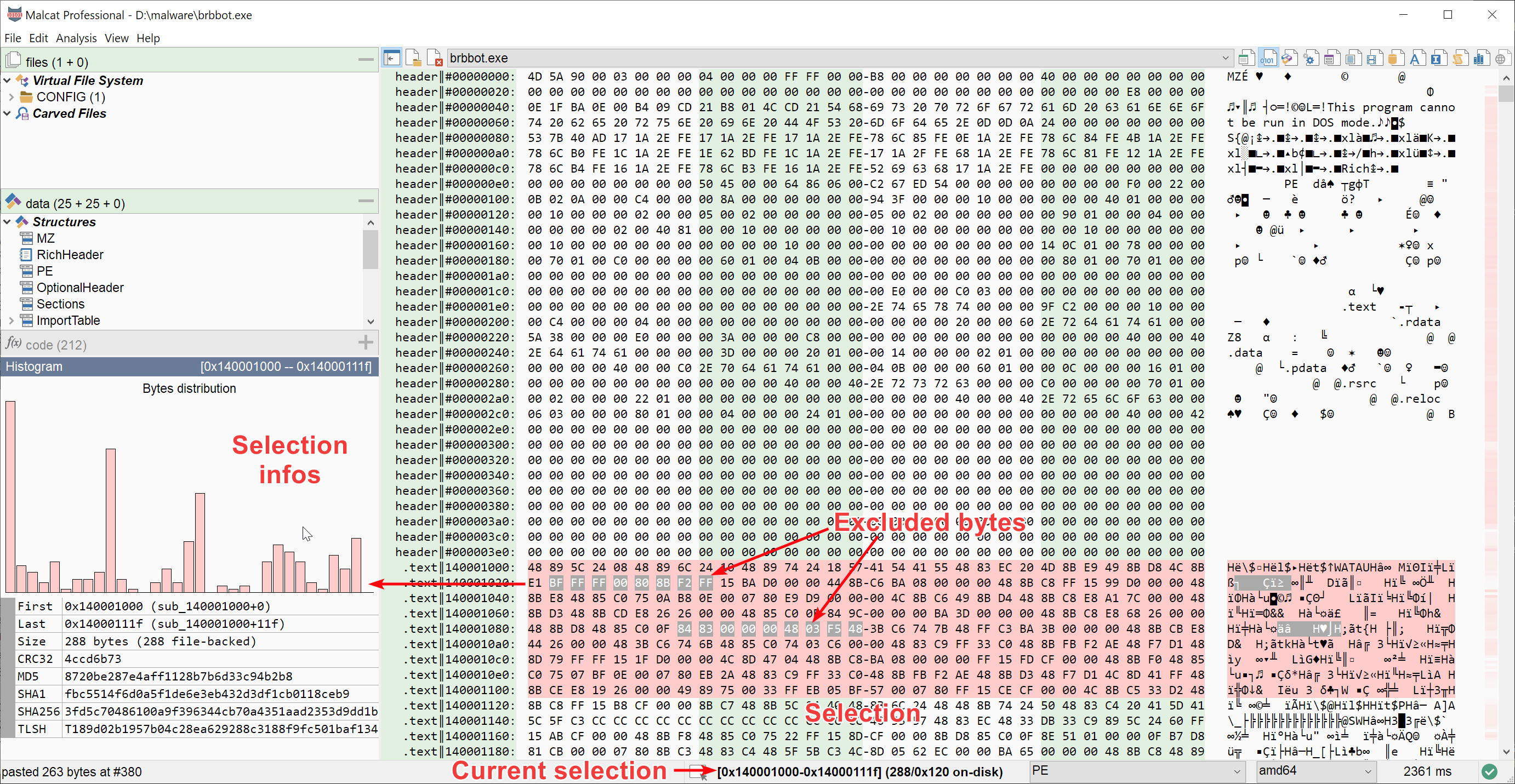
The next two color groups, Selected and Excluded are used for respectively:
Selected text in all views
Bytes excluded from the selection
[Selected]
ForegroundColor=#000000
BackgroundColor=#ffcccc

[Excluded]
ForegroundColor=#ffffff
BackgroundColor=#aaaaaa
The Selected background color is furthermore used as the main color for:
the histogram bars (cf. picture below)
the entropy scroll bars (cf. Augmented navigation bar for instance)
To be precise, the entropy colors are displayed using a linear gradient starting with the selected background color (for high entropy) and ending with the normal background color (for low entropy).
Selection and exclusion colors
Palette colors
Malcat uses different colors (up to 8) to display all the different elements/annotations its core analyses have discovered: functions, structures, known patterns, references, etc. This is called Highlighting and it uses the theme’s palette. The theme may define up to 8 palettes colors in the [Palette] group. If less than 8 color are specified, the theme’s palette color are repeated until 8 colors are defined.
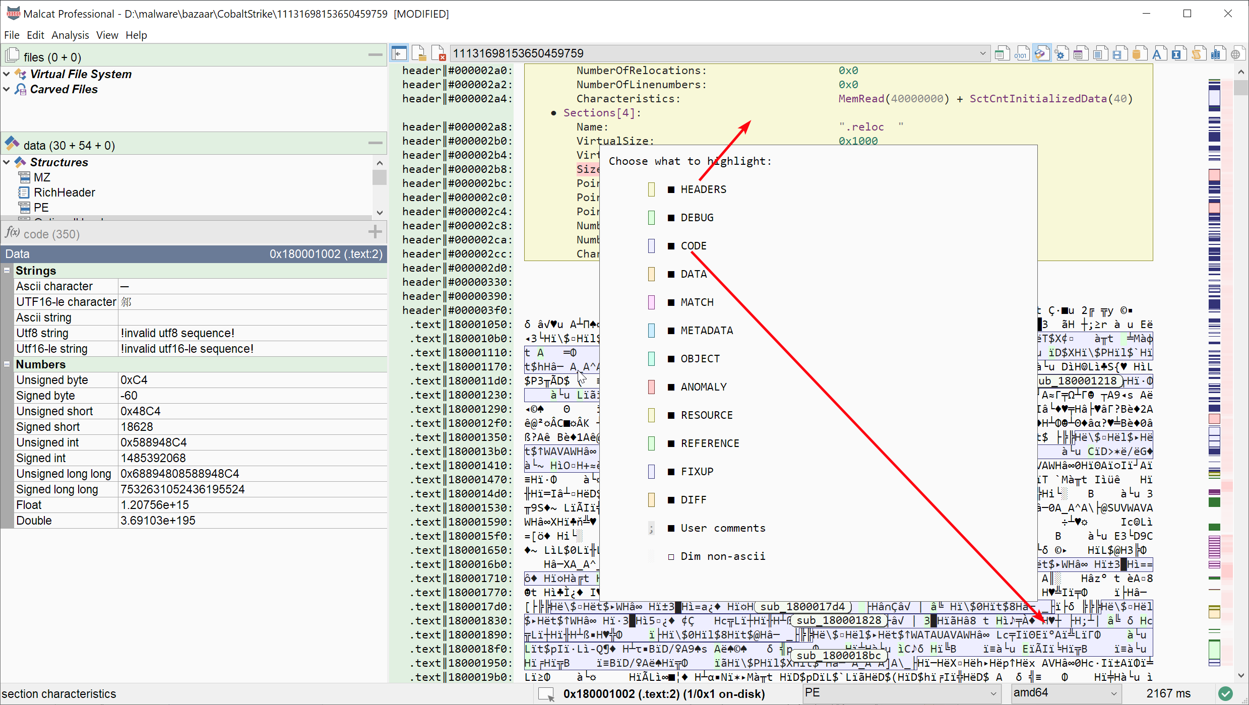
Palette colors used for highlighting annotations
Here is an example: you define the palette colors Palette/0 = red, Palette/1 = blue and Palette/5 = green in your theme, the resulting palette will be: 0 = red, 1 = blue, 2 = red, 3 = blue, 4 = red, 5 = green, 6 = red, 7 = blue.
[Palette]
[Palette/0]
ForegroundColor=#222222
BackgroundColor=#ff8888
BorderColor=#cc8888

[Palette/1]
ForegroundColor=#222222
BackgroundColor=#8888ff
BorderColor=#8888cc

[Palette/5]
ForegroundColor=#222222
BackgroundColor=#88ff88
BorderColor=#88cc88
For Highlighting, the palette colors used depends on the type of the annotation:
Annotation category |
Palette index |
|---|---|
Structure |
0 |
Debug info / library function |
1 |
Code / function |
2 |
Data / variable |
3 |
Search result / known pattern |
4 |
Metadata / properties |
5 |
Carved files |
6 |
Anomaly |
7 |
Resources |
0 |
Cross-references |
1 |
Fixup data / index |
2 |
Diff (addition) |
2 |
Diff (modification) |
3 |
Note that the palette colors, to be precise the border colors of the palette entries, are also used in the Disassembly view and Source code view for syntax highlighting. Using the preference dialog via , the user can assign palette border colors to any syntactic element.
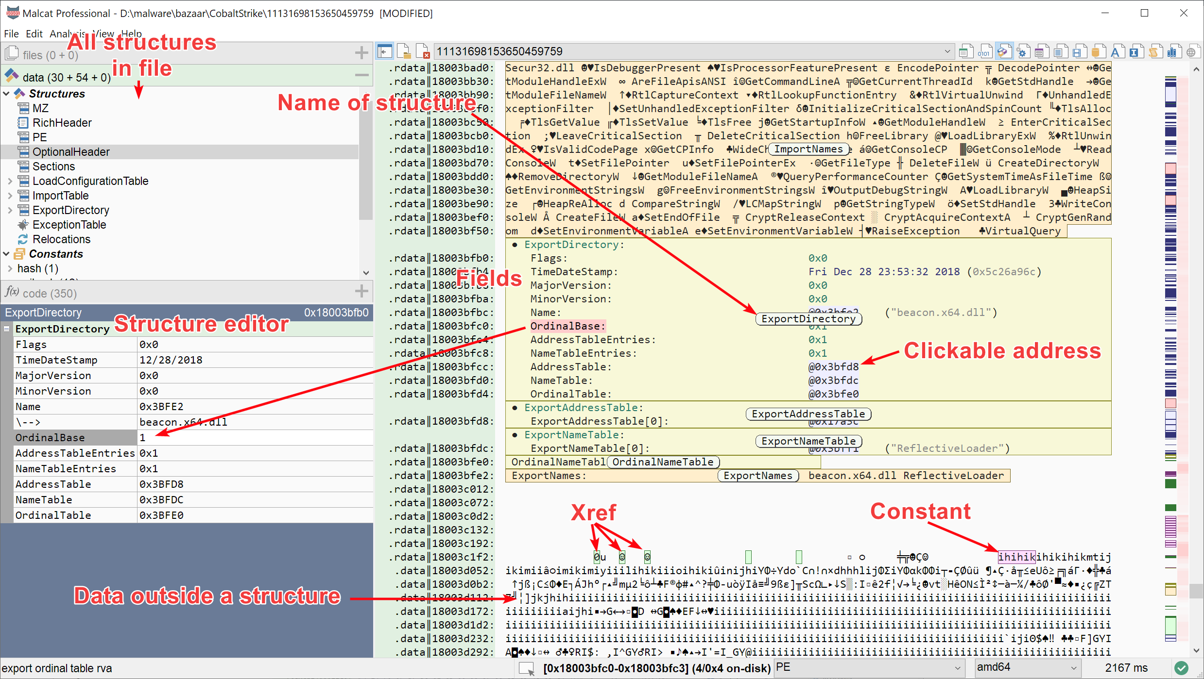
Addresses colors
Malcat can display clickable address fields in the Quick report and for address fields in the Structure/text view.
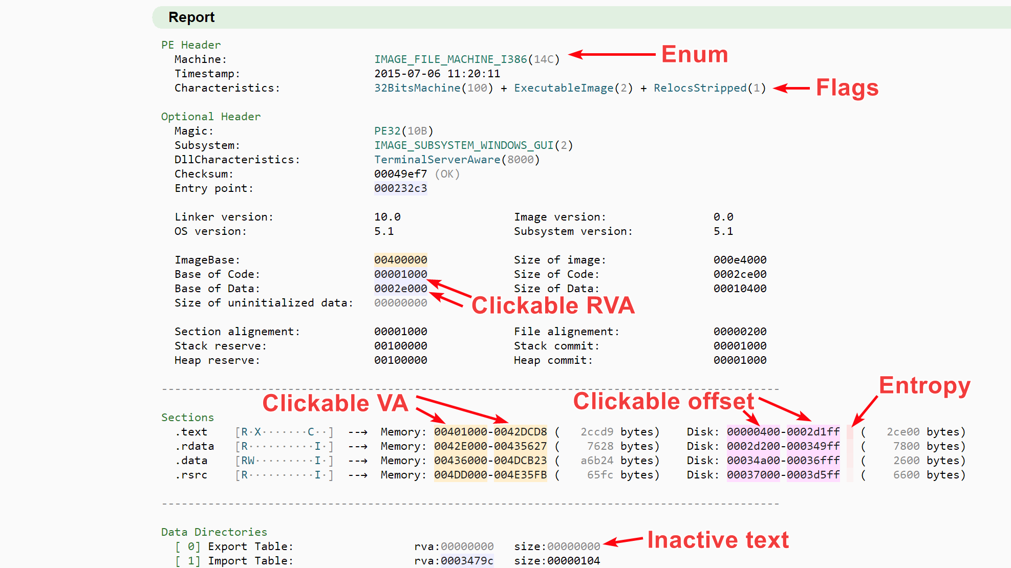
Clickable addresses in summary view
Each type of address (RVA, virtual address and file offset) gets its own color, defined in the [Address] group as follow:
[Address]
[Address/Rva]
ForegroundColor=#222222
BackgroundColor=#EEEEFF
BorderColor=#333377

[Address/Va]
ForegroundColor=#222222
BackgroundColor=#FFEECC
BorderColor=#776622

[Address/Offset]
ForegroundColor=#222222
BackgroundColor=#FFDDFF
BorderColor=#773377
Note that if your theme doesn’t defines address colors, the palette colors 2, 3 and 4 will be used as default colors.
Structure colors
Structure colors are text colors used exclusively in the Structure/text view. First, header colors are used to display structure names depending on the structure nesting level: HeaderLevel1, HeaderLevel2 and HeaderLevel3. For deeply nested structures, where the nesting level is > 3, the headers colors are repeated, e.g. HeaderLevel1 text color will be used on the 4th nesting level.
Structure fields have specific colors HeaderLevel1
Structure field names use the foreground Normal color. Structure field values use colors depending on the field type:
Numerical fields (
UInt8,Int32, etc.) use theNumberFieldcolorString fields (
StringAscii,StringUtf8, etc.) use theStringFieldcolorAddress fields (RVAs, VAs, and offset) reuse the Addresses colors
all other fields (timestamps, GUIDs, etc.) use the
OtherFieldcolor
All these structure colors are defined under the [Structure] group as we can see below:
[Structure]
HeaderLevel1=#227766
HeaderLevel2=#773377
HeaderLevel3=#333377

StringField=#773377

NumberField=#227766

OtherField=#333377
Note that if your theme doesn’t defines structure colors, palette colors will be used as default.
Warning
Since by default structures Highlighting is on, these text colors will be painted over the first of the Palette colors (i.e. [Palette/0]). So make sure that all these colors contrast well over the first palette background color.
Dim color
The dim color is a dimmed version of the Normal color, and is used at different places:
in the Summary view for 0 fields or in the File layout
for structure comments the Structure/text view
for non-code disassembly and comments in the Disassembly view
for comments in the Source code view
and some other places
It is defined as follow:
[Dim]
ForegroundColor=#888888
BackgroundColor=#e8e8e8
Label color
The label color is used at a single place: to display annotation names in the Hexadecimal view and Structure/text view, see Name of structure in the screenshot below for instance:
Label color used to display the name of structure
This rounded labels use three different colors: a background color, a text color and a shadow + border color. The shadow (if you pay attention, the rounded rectangle has a thin south-east shadow in addition to its border) can be deactivated if wanted. The colors are defined as follow:
[GroupLabel]
ForegroundColor=#111111
BackgroundColor=#f5f9f1
ShadowEnabled=1
ShadowColor=#444444